The Rebranding of JURAPOL brand
Jurapol is the brand name of a manufacturer of granular, calcium and calcium-magnesium fertilisers.
The products of this family-owned company are characterised by their very high quality, which makes them suitable for both agricultural and household applications.
The brand, which has been on the market for more than 10 years, operates nationwide and supplies the entire country with its products, which are based on raw materials of Jurassic origin.

Jurapol's new logo
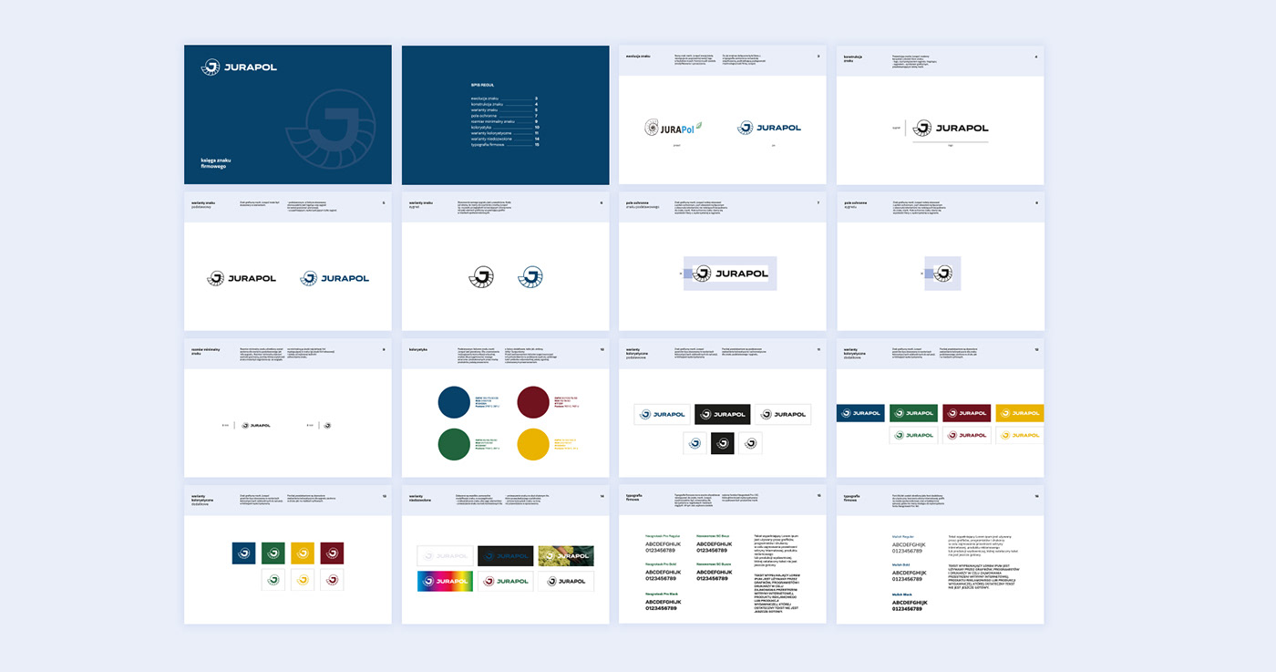
For the new Jurapol brand symbol, we decided to base it on the most distinctive element from the existing logo that is image-related to the products offered by the brand - the shell symbol.
We selected and adapted the typeface in the brand's logotype to indicate the brand's determination, professionalism and experience on the market.
We limited the colour scheme to one leading colour. The brand's colour scheme was established so that it could be associated with each of the products on offer.
Brand logo manual
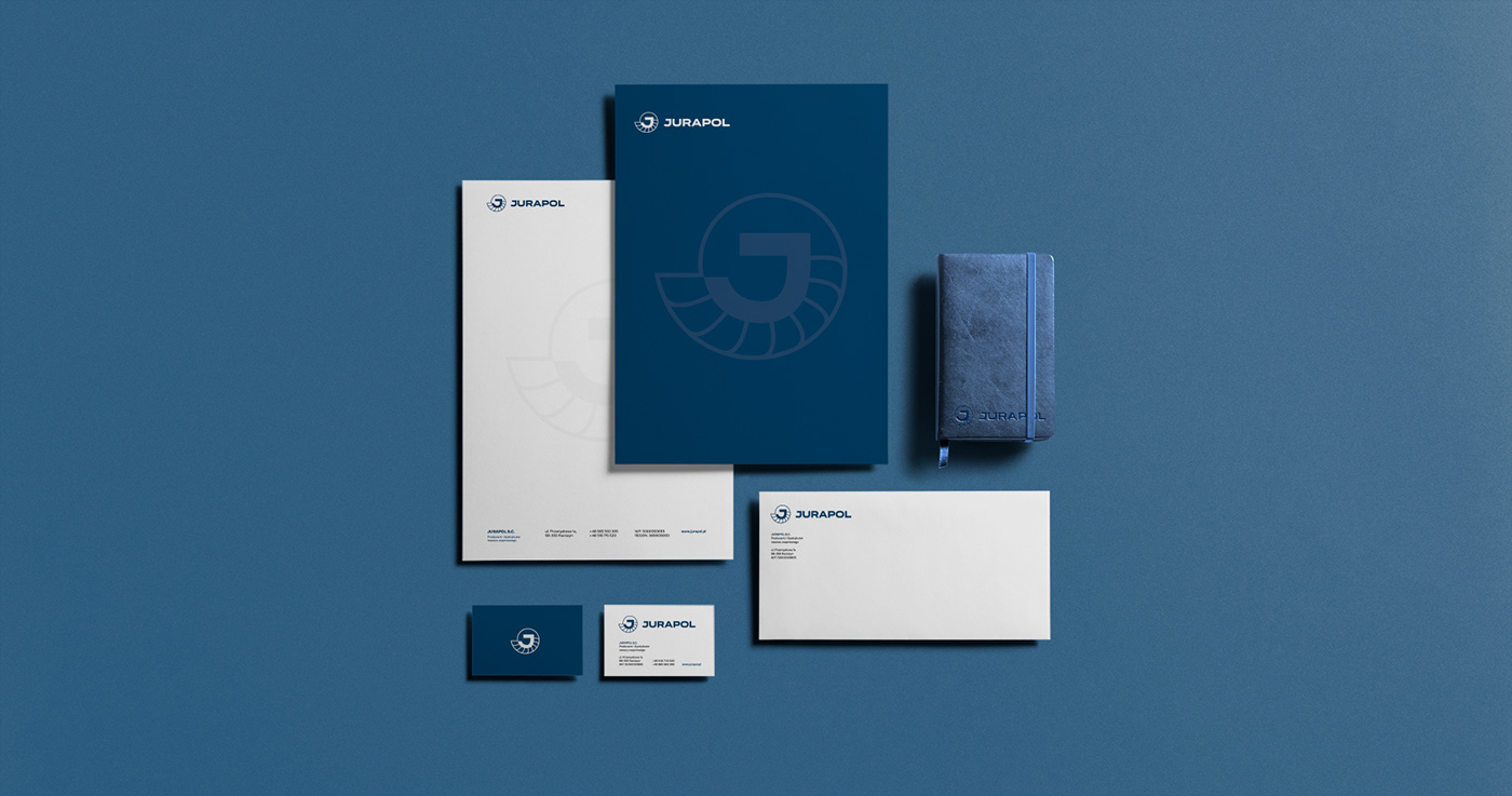
We have developed a brand manual that facilitates the use of the logo in many fields of exploitation, both for communication in digital channels (Internet) and traditional channels - print.
New brand communication
The rebranding of the brand image did not only include the key elements of its image, but also comprehensive brand communication, also linked to the products offered.
We proposed new product names that are linked to the core brand, indicating either the composition or application of the product. And so we created:
JURAPLON - granulated calcium fertiliser, for use in agriculture;
JURAMAGNE - granulated calcium and magnesium fertiliser, for agricultural use;
JURAFLOR - granulated calcium and magnesium fertiliser, for use in horticulture.
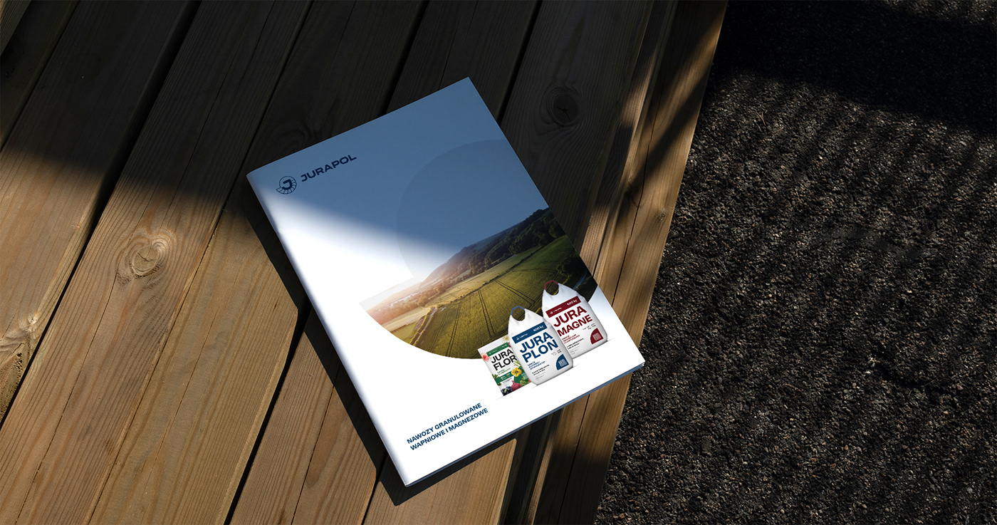
We designed a set of packaging for each product, taking into account both the variable granulation and grammage of the product in the communication.
JURAMAGNE - granulated calcium and magnesium fertiliser, for agricultural use;
JURAFLOR - granulated calcium and magnesium fertiliser, for use in horticulture.
We designed a set of packaging for each product, taking into account both the variable granulation and grammage of the product in the communication.
We opted for slogans and short messages, under the main brand slogan:
"Our fertilisers today, are your good crops tomorrow!".
"Our fertilisers today, are your good crops tomorrow!".
New key visual for the Jurapol brand
As the brand's new key visual, we decided to use the characteristic shell shape from the brand's logo symbol. It fulfils its function as a graphic element used in full colour (e.g. when presenting the brand's products) and, for example, as a framing element for the presentation of image photographs.
We carried out the brand rebranding comprehensively, designing the tools and image elements necessary for effective communication in both traditional media (print) and digital media (Internet).
The scope of our activities included:
+ new visual communication strategy for the JURAPOL brand
+ a new logo for the JURAPOL brand, including a brand book
+ product naming for the JURAPOL brand
+ key visual of the brand
+ designs of packaging of JURAPOL products
+ print design
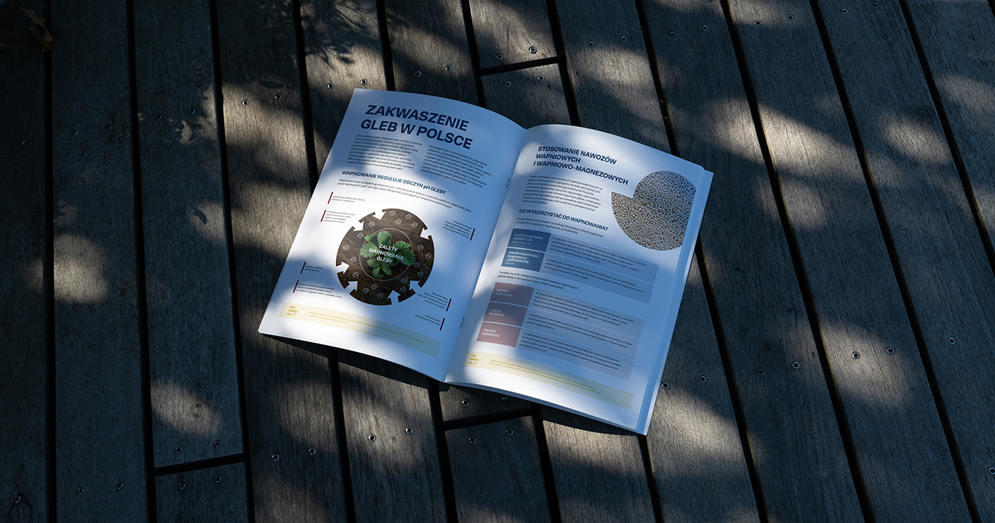
+ folder and product brochure designs
+ interior and exterior signage elements
+ design and implementation of a new website for the JURAPOL brand: www.jurapol.pl
+ communication in social media
+ a new logo for the JURAPOL brand, including a brand book
+ product naming for the JURAPOL brand
+ key visual of the brand
+ designs of packaging of JURAPOL products
+ print design
+ folder and product brochure designs
+ interior and exterior signage elements
+ design and implementation of a new website for the JURAPOL brand: www.jurapol.pl
+ communication in social media